Client
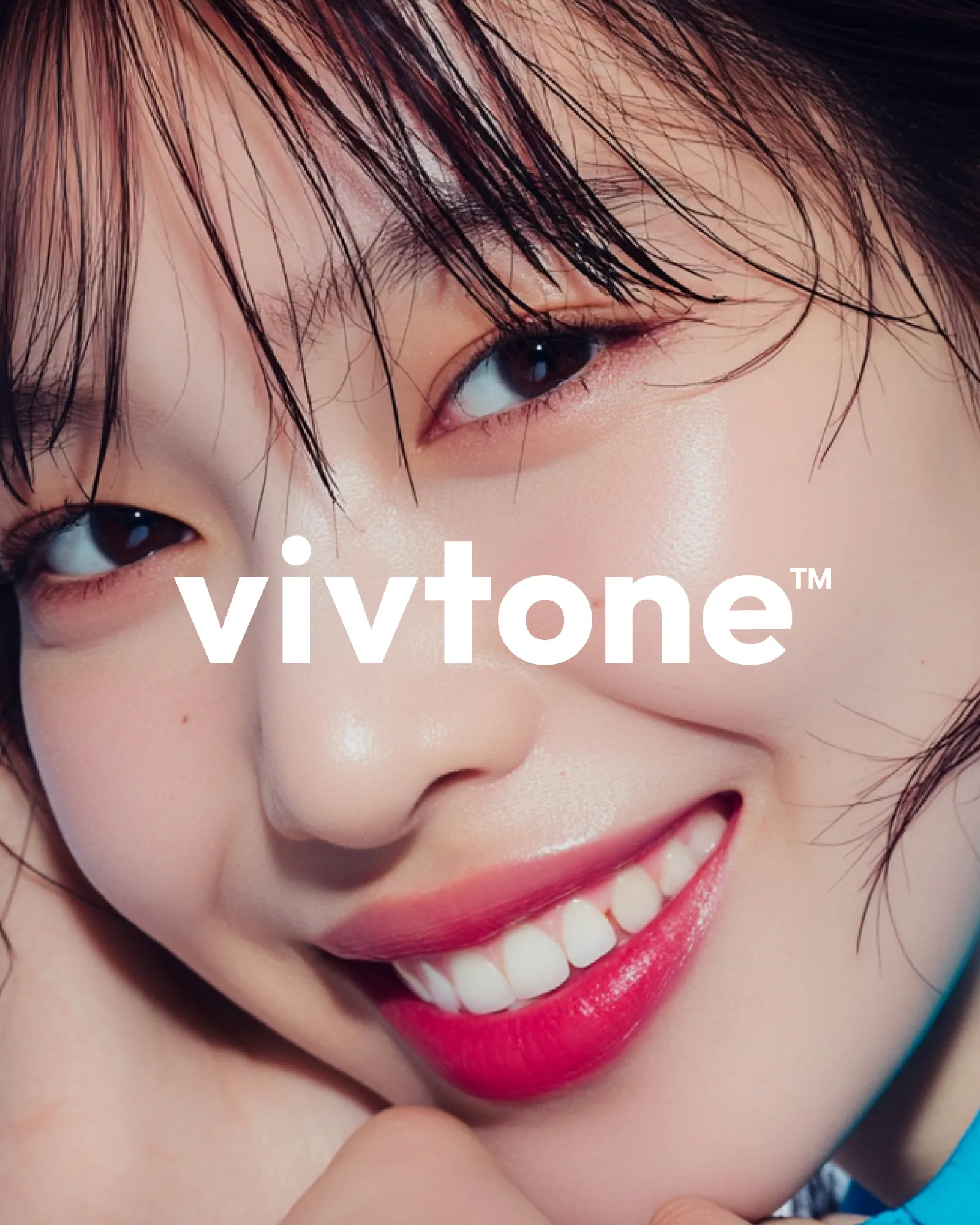
‘vivtone’은 라틴어 vivere(살다)에서 유래하여 생명력, 회복, 활력을 상징하며 피부 본연의 건강한 톤을 되찾는 의료적 가치를 담아낸 이름입니다. 부드러운 발음 구조와 3음절 리듬은 안정감과 전문성을 전달하며, 심플하고 구조적인 로고 디자인은 의료 서비스 브랜드로서의 신뢰를 강화합니다.
브랜드 네이밍부터 로고 디자인, 컬러 시스템, 타이포그래피 개발까지 브랜딩 전반을 진행하였고, 병원 외부 간판, 내부 유리 시트, 층별 사이니지 등 실제 공간에 적용될 모든 실무 디자인과 시공 도면 작업을 통합하여 브랜드 경험을 일관되게 구축했습니다. Vivtone의 철학과 톤앤매너를 공간 전반에 반영해 브랜드 인지도를 극대화하고, 환자가 느끼는 전문성과 신뢰성, 피부 활력의 이미지를 시각적으로 완성하였습니다.
‘vivtone’ is a name derived from the Latin word vivere (to live), symbolizing vitality, recovery, and rejuvenation, and capturing the medical value of restoring the skin’s natural tone. Its smooth pronunciation and three-syllable rhythm convey stability and professionalism, while the simple, structured logo design reinforces trust as a medical service brand. We carried out the entire branding process, from naming and logo design to developing the color system and typography, and extended it to practical applications such as exterior signage, interior glass decals, and floor directory signs. By integrating design with construction drawings, we built a consistent brand experience throughout the space. Vivtone’s philosophy and tone and manner are reflected across the environment, visually enhancing brand recognition and conveying professionalism, trustworthiness, and the image of revitalized skin to patients.