Client
B for BAGEL은 친근하고 경쾌한 비주얼 언어를 통해 브랜드의 즐거운 개성을 강조합니다.
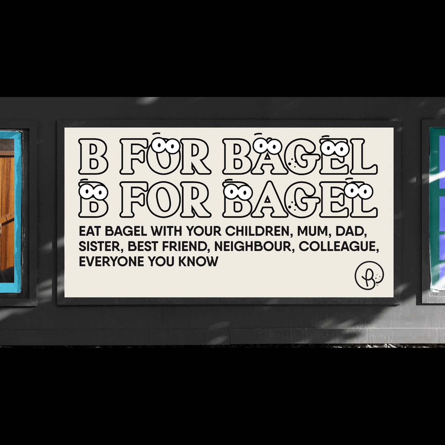
일러스트와 그래픽 모티프는 베이글의 형태적 특징을 유머러스하게 재해석해 시각적 재미를 더합니다.
오렌지와 그린 컬러 팔레트는 신선함과 활력을 전달하며, 다양한 패키지와 굿즈에서 일관된 브랜드 경험을 제공합니다.
타이포그래피는 가독성과 개성을 동시에 갖추어 브랜드 메시지를 직관적이고 기억에 남게 전달합니다.
특히 눈 모양을 활용한 캐릭터 디자인은 브랜드에 유머와 생동감을 부여하며, 소비자와 감성적으로 소통할 수 있는 장치로 작동합니다.
B for BAGEL emphasizes the brand’s playful personality through a friendly and vibrant visual language.
Illustrations and graphic motifs humorously reinterpret the shape of bagels, adding visual delight.
The orange and green color palette conveys freshness and energy, while ensuring a consistent brand experience across packaging and merchandise.
Typography balances readability with character, delivering the brand message in an intuitive and memorable way.
In particular, character designs incorporating eye motifs add humor and liveliness, serving as a device for emotional connection with consumers.
- Tag: B for BAGEL, F&B 브랜딩, 비 포 베이글, 비포베이글