Client
잭슨 프라이드 치킨은 잭슨 피자의 아이덴티티를 확장해 런칭된 치킨 브랜드입니다.
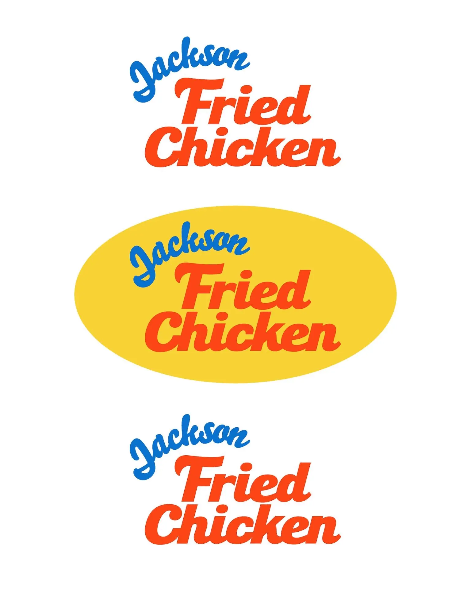
레트로 무드를 반영한 블루와 오렌지 컬러 조합은 활기찬 에너지를 전달하며, 브랜드의 대중적 매력을 강화합니다.
브랜드 아이덴티티는 다양한 형태로 확장 가능한 시스템을 구축해 매장 사인, 패키지, 프로모션 등 모든 접점에서 일관된 브랜드 경험을 제공합니다. 타이포그래피와 그래픽 모티프는 브랜드의 정체성을 직관적으로 표현하면서, 소비자에게 쉽게 인식되고 기억될 수 있도록 설계되었습니다.
Jackson Fried Chicken is a chicken brand launched as an extension of Jackson Pizza’s identity.
The retro-inspired blue and orange color palette conveys vibrant energy and enhances the brand’s mass appeal.
Its brand identity is built on a versatile system that can be expanded across store signage, packaging, and promotions, ensuring a consistent brand experience at every touchpoint.
Typography and graphic motifs are designed to express the brand’s identity intuitively, making it easy for consumers to recognize and remember.
- Tag: JKC, 잭슨 프라이드 치킨, 잭슨치킨, 잭슨피자 브랜드 디자인