Category
Client
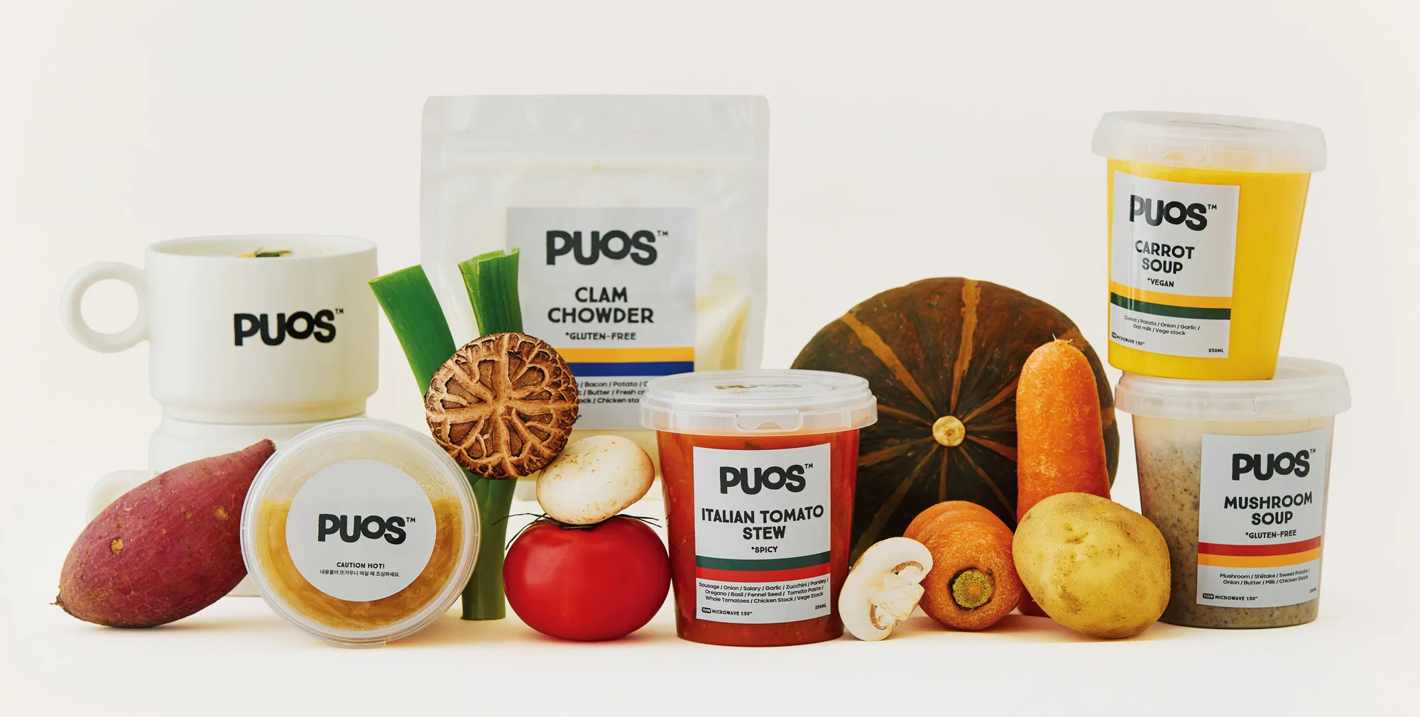
퍼스(PUOS)는 수프를 중심으로 한 국물 요리를 현대적인 감각으로 제안하는 식문화 브랜드입니다. ‘PUOS’는 ‘SOUP’의 철자를 거꾸로 쓴 이름으로, 익숙한 음식을 새로운 시각으로 바라보며 일상의 식문화를 재해석하겠다는 브랜드의 방향성을 담고 있습니다. 퍼스는 서양식 수프는 물론, 스튜, 카레, 국과 찌개까지 아우르며 건강하고 여유로운 삶의 태도를 음식으로 전하고자 합니다.
OSC는 퍼스의 정체성이 명확하게 드러나면서도, 다양한 제품군과 접점에서 유연하게 확장될 수 있는 브랜드 디자인을 구축했습니다. 로고는 조형적 단순화를 통해 브랜드가 지향하는 ‘담백함’과 ‘일상의 친근함’을 시각화했고, 곡선 중심의 구조는 음식이 주는 따뜻하고 편안한 인상을 유연하게 반영합니다.
컬러, 서체, 여백의 구성은 매장, 패키지, 디지털 등 다양한 환경에서도 일관된 인상을 유지할 수 있도록 설정되었으며, 퍼스가 제안하는 진심 어린 식문화가 시각적으로도 자연스럽게 전달될 수 있도록 전체 시스템을 정돈했습니다.
PUOS is a contemporary food brand that reinterprets traditional broth-based dishes through a modern lens. The name ‘PUOS’ is a reversal of the word ‘SOUP,’ reflecting the brand’s aim to view familiar foods from a new perspective and redefine everyday eating culture. Going beyond Western-style soups, PUOS offers a wide range of menu items, including stews, curries, and Korean-style soups and stews, all rooted in the pursuit of a healthier and more relaxed lifestyle.
OSC developed a brand identity that clearly communicates PUOS’s values while allowing for flexible expansion across various applications. The logo was designed with simplified forms to express the brand’s focus on clarity and familiarity, while the rounded, soft structure conveys the warmth and comfort associated with nourishing food.
The overall identity system—encompassing color, typography, and spacing—was designed to maintain visual consistency across physical and digital touchpoints. The result is a brand that quietly and confidently communicates PUOS’s sincere approach to food culture.